甚麼是SweetAlert2?
它是一個美麗、可客製化、專門用在JavaScript 上的一個插件
而且它還支援現今主流的JavaScript框架,包含React、Vue、Angular等等

下載及應用
下載
到 sweetalert2 官方頁面下載或用以下指令
npm install sweetalert2應用
直接以傳統方式導入
<script src="sweetalert2.min.js"></script>
<link rel="stylesheet" href="sweetalert2.min.css">
又或者使用ES6 Modules 或 TypeScript 方式導入
// ES6 Modules or TypeScript
import Swal from 'sweetalert2'

// CommonJS
const Swal = require('sweetalert2')
調用 SweetAlert2 的 function
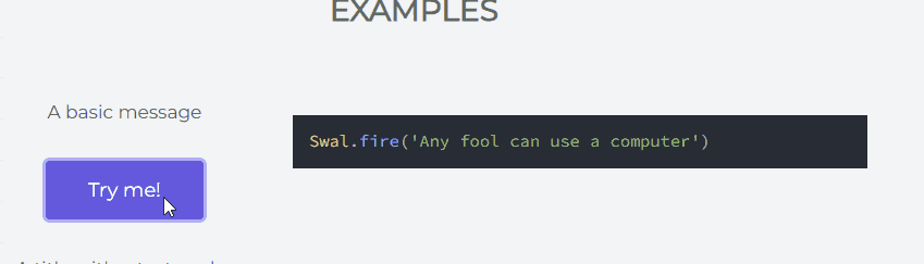
Swal.fire({
  title: "Hey!",
  text: "Do you want to continue",
  icon: "info",
  confirmButtonText: "Custom Text",
});
常用到的 configuration
更詳細的內容可到官方查閱
title
顧名思義即是顯示出來的主題,讓使用者能夠清楚大概表達的內容
input type
讓使用者能夠輸入內容,當中包括 text, email, url, password, textarea, select, radio, checkbox, file, range… 等等
目前還未支援multiple input,若然真的需要使用到 multiple input 的話,可以在html 屬性設定
input type的範例可參考官方的例子
html
上述提到,若然要使用multiple input 的話就需要使用到html 這個屬性, 因為這個屬性可以讓你以html 形式來展示你的內容
就像以下例子
Swal.fire({
  title: "Hey!",
  html: `<label>Name:</label> <input type="text"> <br> <label>Gender:</label><input type="radio" name="gender" value="M" id="M"><label for="M">M</label><input type="radio" name="gender" value="F" id="F"><label for="F">F</label>`,
  icon: "info",
  confirmButtonText: "Submit",
});
這樣就能有多個input 選項,或者其他客製化的內容
icon
設定顯示的icon類型,icon有助於使用者辨識跳出窗口的大概內容
icon的類型可到官方參考
position
窗口顯示的位置,預設是”center”, 可設定為 “top”, “top-start”, “top-end”, “center”, “center-start”, “center-end”, “bottom”, “bottom-start”, “bottom-end” 等等
allowOutsideClick
決定可否點擊窗口以外的地方時會否將窗口關閉,預設是 true,如果你不想使用者點擊其他位置是誤把窗口關閉,可將它設定為 false
showConfirmButton 、showCancelButton
決定是否顯示 confirm 或 cancel 按鈕,showConfirmButton預設是 true,而showCancelButton預設是 false
confirmButtonText、cancelButtonText
定義 confirm 及 cancel 按鈕的文字內容,confirm 按鈕預設文字是 “OK”,而 cancel 按鈕預設文字是 “Cancel”
preConfirm
這個較為複雜,它在confirm 之前會執行,並且執行完結後會回傳一個結果到 confirm
而它可以調用同步(sync)或異步(async)的函數
function myAlert() {
  Swal.fire({
    title: "Hey!",
    html: `<label>Name:</label> <input type="text" id="name"> <br> <label>Gender:</label><input type="radio" name="gender" value="M" id="M"><label for="M">M</label><input type="radio" name="gender" value="F" id="F"><label for="F">F</label>`,
    icon: "info",
    confirmButtonText: "Submit",
    preConfirm: async function (value) {
      console.log(value);

      let response = await check();

      console.log("response", response);

      if (response) {
        return response;
      } else {
        Swal.showValidationMessage("only support M");
      }
    },
  }).then((response) => {
    console.log(response);
    Swal.fire("pass!", "", "success");
  });
}

async function check() {
  const name = document.querySelector("#name").value;
  const gender = document.querySelector(
    'input[name="gender"]:checked'
  ).value;

  console.log(name, gender);
  await timeout(3000); //模擬等待伺服器回傳資料

  let result;

  if (gender == "F") {
    result = false;
  } else {
    result = true;
  }

  return result;
}

function timeout(ms) {
  return new Promise((resolve) => setTimeout(resolve, ms));
}
showLoaderOnConfirm
它與 preConfirm 一起使用,當使用者按下 confirm按鈕時,會變為Loading的圖示,直至preConfrim執行完畢
Toast
以較小的形式顯示,通常配上timer 使用
Swal.fire({
    toast: true,
    position: "top-end",
    showConfirmButton: false,
    timer: 2000,
    icon: "success",
    title: "Login successfully"
});
timer、timerProgressBar
timer 設定窗口顯示的時間,以ms為單位,預設是 undefined
timerProgressBar 設定是否顯示進度條,預設是 false